Here is a counter. It counts up, it counts down, and you can reset it. It is the most boring app I can think of, and I picked it on purpose.
Because the interesting thing is not the app. The interesting thing is that the exact same app —
the same TSX, the same styles.css — is running on two devices that have almost nothing in
common. One is a full-color Linux panel: emissive, backlit, touch-driven. The other is a monochrome
e-paper screen: reflective, no backlight, no touch at all. You operate that one with the physical buttons
on the board.
Two pieces of glass that could not be more different. One codebase. No fork, no #ifdef, no
second project. That is the whole point of this post.
This is the reactive-counter example, and it is the follow-up I promised in
the last one — where I argued that you don't interpret CSS on a tiny chip, you compile
it. Same idea here, pointed at a harder question: what happens when the chip's screen changes out from
under your app?
The component owns its state and its behavior
At the heart of gea is a reactive component. It owns its state. It owns its behavior. You write everything in TypeScript and it compiles to native C++ — no interpreter, no VM left on the device. Here is the whole counter, near enough verbatim:
import { Display, ReactiveComponent, mount } from 'gea-embedded'
import './styles.css'

// E-paper refresh policy (no-op on boards without an e-paper panel). The
// counter has no animation — every update uses the slow, crisp vendor waveform.
Display.setEpaperRefreshConfig({ fastStreakWindowMs: 0 })

export class App extends ReactiveComponent {
  count = 0
  increment() { this.count = this.count + 1 }
  decrement() { this.count = this.count - 1 }
  reset() { this.count = 0 }

  keydown(keyCode: number) {
    // Hardware buttons (e-paper BOOT/PWR) and keyboards: ArrowUp / ArrowDown.
    if (keyCode === 38) this.increment()
    else if (keyCode === 40) this.decrement()
  }

  template() {
    return (
      <div class="counter-app" onKeyDown={event => this.keydown(event.keyCode)}>
        <span class="counter-title">Counter</span>
        <div class="counter-card"><span class="counter-count">{this.count}</span></div>
        <div class="counter-controls">
          <div class="counter-button counter-button--minus" onClick={() => this.decrement()}>
            <span class="counter-minus-label">-</span>
          </div>
          <div class="counter-button counter-button--plus" onClick={() => this.increment()}>
            <span class="counter-plus-label">+</span>
          </div>
        </div>
        <div class="counter-reset" onClick={() => this.reset()}>
          <span class="counter-reset-label">Reset</span>
        </div>
      </div>
    )
  }
}

mount(App)
That's the app. count is reactive state — assign to it and the view that depends on it
re-renders. increment, decrement and reset are the behavior, living
right on the component. The template() is JSX. Nothing in this file knows or cares what kind
of screen it will land on. That ignorance is the feature.
The look is defined entirely in CSS
The look lives entirely in styles.css. gea supports any TrueType font, so the counter loads
Oswald straight from a .ttf with @font-face — no system fonts assumed, no
special pipeline:
@font-face {
  font-family: 'Oswald';
  src: url('../../assets/fonts/Oswald-Regular.ttf');
}

.counter-app {
  font-family: 'Oswald';
  background-color: #07111f;
  padding: clamp(10px, 3.5vh, 54px);
  /* flex column, vh/vw sizing throughout */
}

.counter-count {
  font-size: clamp(46px, 17vh, 220px);
  color: #67e8f9;
}

.counter-card {
  background-color: #0f172a;
  border-color: #1e293b;
}
This is the part people miss about responsive design on hardware. The sizes are not pixel constants; they
are clamp() over vh and vw. So the layout doesn't target one board
— the same stylesheet fits a watch-sized AMOLED, a 7-inch panel, and the e-paper device, because the type
and the padding scale to whatever viewport the panel reports. One layout, every screen. No per-device fork
to keep the proportions right.
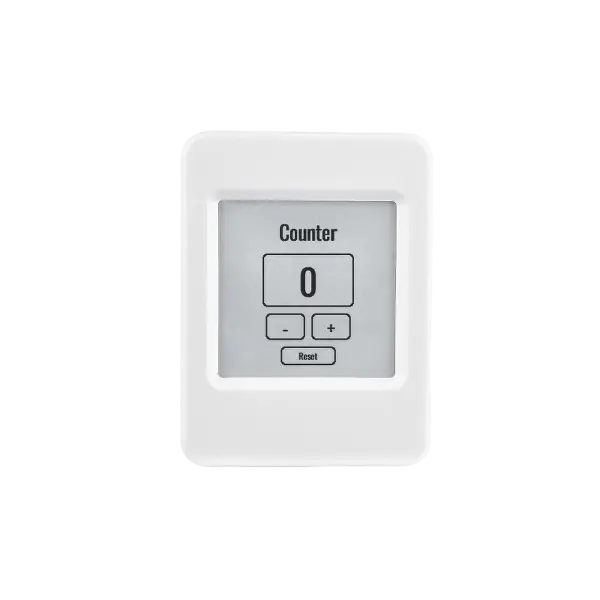
On a backlit color display this reads exactly as you'd want: cyan numerals on a near-black field, a card with a faint border. Tap plus, the count goes up; tap reset, it's zero. So far there is nothing to write home about — it's just a UI.
Now move it to the e-paper.
On e-paper, one media query flips the theme
An e-ink panel has no backlight. It builds its image out of reflected light, the way ink on paper does, and these panels are 1-bit: black or white, nothing in between. A dark theme is the wrong instinct here. Cyan on near-black would dither into a field of gray speckle, and the whole thing would read muddy and soft instead of sharp.
You have two honest options. You can fork the project and maintain an e-paper-flavored counter forever. Or
you can tell the truth about where the app is running and let the stylesheet adapt. gea evaluates media
queries at runtime against the real panel — including (monochrome). So you write the
override right next to the dark theme:
/* 1-bit panels (e-paper): pure black-on-white reads crisply with no dither
   speckle, so flip the dark theme to light. Color boards keep the dark theme
   (their (monochrome) evaluates false — on web the browser does the same). */
@media (monochrome) {
  .counter-app   { background-color: #ffffff; }
  .counter-title { color: #000000; }
  .counter-card  { background-color: #ffffff; border-color: #000000; }
  .counter-count { color: #000000; }
  .counter-button--plus,
  .counter-button--minus { background-color: #ffffff; border-color: #000000; }
  .counter-reset { background-color: #ffffff; border-color: #000000; }
}
That's the entire change. Flip the dark theme to black-on-white so a 1-bit panel can render it sharp, with
no dither. The component never finds out. The numerals are still clamp(46px, 17vh, 220px);
the layout is still the same flex column. The colors changed; the structure didn't.
And notice the semantics are exactly the browser's. On the color board — and on the web simulator —
(monochrome) evaluates false, so the dark theme stays. There is no special e-paper code path.
It is the same media-query rule the browser would apply, evaluated against real hardware instead of a
window.
You don't rewrite the app for the new screen. You tell the app the truth about the screen, and let CSS do the adapting.
No touch? Then listen for keys
There is one thing CSS cannot fix: the e-paper device has no touch screen. There is nothing to tap. Instead it has physical buttons — BOOT and PWR — and a button press arrives as a keydown event with a key code attached, exactly like a keyboard's arrow keys.
So you listen. Look back at the component and you'll see it was already wired:
keydown(keyCode: number) {
  // Hardware buttons (e-paper BOOT/PWR) and keyboards: ArrowUp / ArrowDown.
  if (keyCode === 38) this.increment()
  else if (keyCode === 40) this.decrement()
}
Key code 38 is ArrowUp, 40 is ArrowDown, and they call the same increment and
decrement the on-screen buttons call through onClick. That is the whole story of
input here: onClick for touch, onKeyDown for buttons, both funneling into the
same two methods. The behavior lives in one place; touch and buttons are just two different doors into it,
and the methods never learn which door you came through.
One authentic detail about e-paper
One line at the top of the file earns a mention:
Display.setEpaperRefreshConfig({ fastStreakWindowMs: 0 })E-paper has two kinds of refresh: a fast one that's prone to ghosting, and a slow vendor waveform that's crisp. Because this counter has no animation — the number just changes, now and then, when you press a button — there's no reason to chase speed. Setting the fast window to zero says: always take the slow, clean path. On a board without an e-paper panel, the call is a no-op. The app can hint at how it wants to be drawn without naming, or caring about, the panel underneath it.
What actually traveled between the two devices
Step back and count what changed when this app crossed from a backlit color panel operated by touch to a reflective 1-bit one operated by buttons:
- The component, its state, and its logic: unchanged.
- The JSX template: unchanged.
- The responsive layout — the
clamp()/vh/vwsizing: unchanged. - The stylesheet: one
@media (monochrome)block flipping the theme to black-on-white. - The input: a
keydownhandler — already in the component — calling the same methods touch calls.
No fork. No second build full of conditionals. No interpreter shimming the difference at runtime, because there is no interpreter — it all compiled down to native C++ ahead of time. What adapted, adapted at the edges, in the places designed to adapt: a media query for the look, an event handler for the input.
That is the difference between writing for a screen and writing for screens. Most embedded UI work assumes you know your one panel forever and you marry it. gea lets you write the app once and let it meet whatever glass shows up — emissive or reflective, touch or buttons — and look right on each.
In the end the counter is still boring. It still just counts up and down. But it counts up and down on two devices that share a codebase and almost nothing else, and it never had to know the difference. That is gea.
This is the second post in the series.